Why I love... Wolves' programme covers
When your team is nicknamed “Wolves” there is lot a room for imaginative storytelling.
Generally, English football teams do not possess the variety of attributions you see in NFL, basketball, baseball or even short-form cricket.
It is going to be "Town", "United" or "City". If you are lucky you might be a "Rovers".
And, with respect, even "Wolverhampton Wanderers", who hail from the traditional, industrial area of England called “The Black Country”, would hardly suggest an innovative narrative.
But their shortened name is evocative and they have leveraged it to produce a series of eye-catching, memorable programme covers this season.
They ditched the bog-standard action shot, employed an illustrator and produced something original.
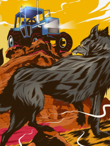
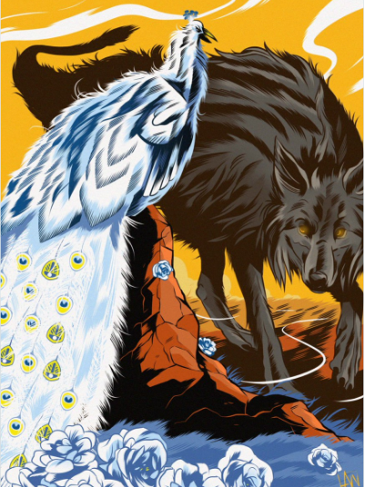
Like the beautiful game itself, the work is artistic, emotional and gladiatorial. Each game depicts a snarling wolf facing a foe whose image is based on the opponent’s crest, colours or nickname.
So here we have the first in our 2016/17 series: Wolves v @ReadingFC#WOLvREA pic.twitter.com/pZva23e3Jy
— Wolves (@Wolves) August 11, 2016
Against Chelsea in the FA Cup, they used the lion from the Londoners’ badge. Against Leeds it was a peacock, against Reading it was a knight and against Ipswich it was a tractor; each time intelligently doffing a cap to the pageantry of the sport.
The images have also been used on social media to promote upcoming games and, significantly, to adorn the players' tunnel.
📸 We have a new-look tunnel at Molineux. A big thank you to @WellsIllustrate for helping us with the redesign. #WOLvNEW pic.twitter.com/i9KMTEWQgK
— Wolves (@Wolves) February 11, 2017
In the social media age, the position of traditional English football programmes (matchday magazines) must be under threat.
Way back when, there was little alternative. Half-time entertainment was one of the following:
- music from an inaudible tannoy
- queuing for a beer/pie/Bovril/toilet break
- inane on-pitch activities
- transistor radios small enough to fit in anorak pocket
These days, if you can get a signal in the ground, it’s about Twitter or your team’s Fan Channel on YouTube.
I would love up-to-date figures but I suspect programme sales have dwindled substantially in last decade. They remain a symbolic souvenir for tourist fans but the future could be uncertain at most clubs outside the big six in the Premier League given price, alternative entertainment and the usual restrictions of club-produced content.
Therefore it will be interesting to see if Wolves’ innovative approach is deemed profitable enough to continue next season. Hopefully with a new twist. Another measure of success, artistically at least, will be if other clubs take the same route.
This is not a first, similar programme covers have been created before. But, as ever, it is not about the idea but the execution and Wolves have done this exceptionally well. Recently they snagged @Wolves on all major social media platforms. Another coup.
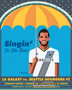
In a similar vein, a number of MLS teams have produced match day posters in seasons gone by. Artistically, my favourite came from Seattle Sounders however LA Galaxy’s version had the advantage of having been created by Dan Gargan, a defender for the team at the time.
That is going to a different level.
But Wolves must take a bow for being bold enough to invest in something different.
* Why I Love… is a regular series on MrRichardClarke.com celebrating excellence, innovation or just difference in digital sport. Criticism and deconstruction is easy, creativity and effective execution is hard. Let’s support those who concentrate on the latter.


